
This project, situated in the central district of the Greater Bay Area, is dedicated to forging a modern technological workplace that is both aesthetically resonant and highly functional. Drawing inspiration from Collage Art and utilizing a sophisticated Orange-Cyan palette, we have endowed the space with a multi-layered sensory experience.
The Rhythm of Collage, The Hue of Innovation
The graphic design inspiration stems from Collage Art, a movement rooted in early 20th-century Cubism, where artists like Picasso shattered monolithic perspectives by fragmenting and reassembling materials to construct new visual narratives. Today, Collage Art is re-interpreted in contemporary interior design through a diverse combination of colors, shapes, and material textures, injecting a dynamic rhythm and artistic tension into the office environment.
The Tension of Orange and Cyan
The color scheme is inspired by the visual language of cinema—the striking Orange-Cyan (or Teal and Orange) contrast. As a set of complementary colors, this pairing is simultaneously retro and futuristic, creating a powerful visual impact. When juxtaposed, the contrast between warm and cool, movement and stillness, emotion and rationality, generates an exquisite tension.
Cool Tones for Stillness, Warm Tones for Motion
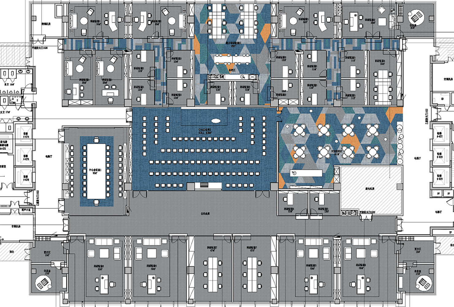
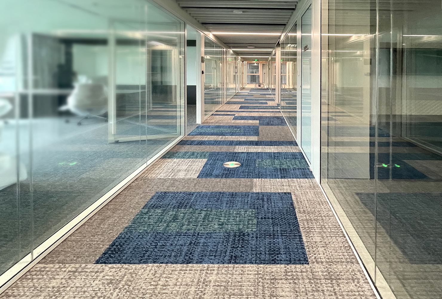
The color selection is not merely an aesthetic choice; it is a strategic decision. It serves as a spatial planning tool based on color psychology. Areas requiring focus and efficiency—such as corridors, meeting rooms, and private offices (the quiet zones)—employ low-luminosity, low-saturation cool tones of cyan, gray, and silver. This palette cultivates a sense of order and concentration, minimizing distractions and subtly extending the perception of time.
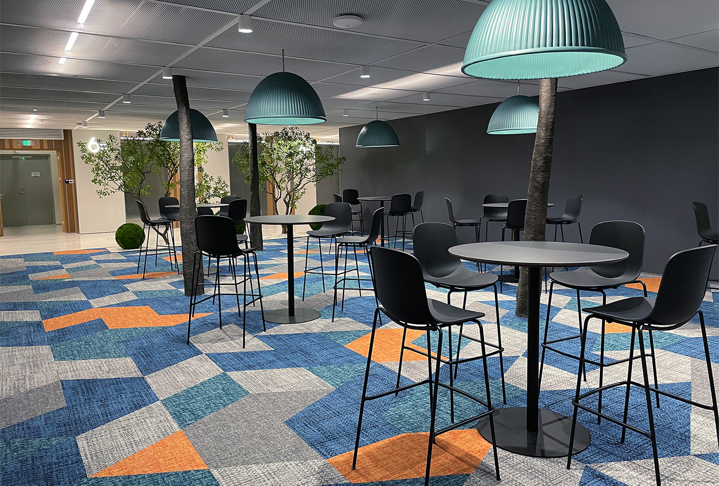
The active zones, including casual lounges and discussion areas designed to foster communication and creativity, boldly incorporate high-saturation orange. These vibrant orange blocks act as visual focal points, stimulating innovative vitality and a desire for interaction. Meanwhile, stable blue and neutral gray domains serve as the grounding base, balancing the overall energy and preventing excessive visual noise.
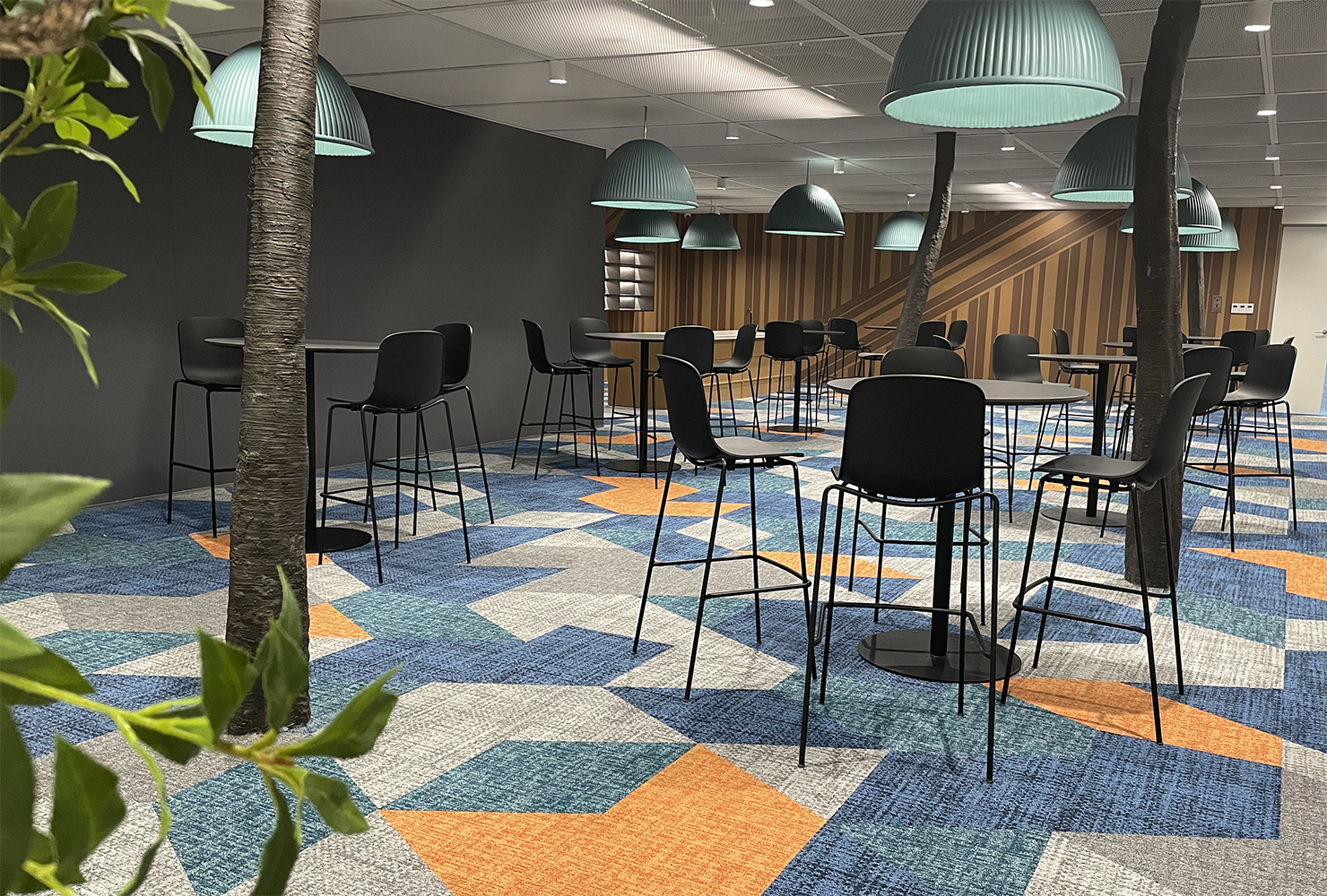
In the discussion and leisure areas, we use an asymmetric collage of geometric modules in blue, orange, and gray. This dynamic design language defines the area's spatial attribute: encouraging informal communication and sparking creative collisions. It also challenges conventional perceptions of the typical corporate tech environment.
This project stands as a testament to how thoughtful design can transform a workplace into a source of inspiration, efficiency, and artistic expression.